Some of you may remember the post I did about my mom's mismatched hutch. I mentioned in that post that she had a second one she was working on. Well, she finished it! She basically used the top from the original hutch to go with this dresser that she had already painted cream for her living room. You can see the other hutch here. Unfortunately, I don't have a before picture of the bottom portion of this hutch, but it was just an ordinary dresser in need of some TLC.
Here's the picture I showed you before of the original hutch. She took the top portion off of this hutch to pair it with this dresser. You can read about why she did this in the other post.
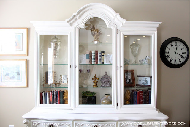
I asked my mom if she would mind if I took a picture of her staging and then tweaked it a bit to show some simple solutions for styling bookshelves. She obliged, thanks mom! Here it is after she painted everything a creamy white and staged it herself. She also got rid of those metal grates because they were just obstructing the view and making things too busy. It really didn't look bad at all, but I knew with a little tweaking it could look even better.
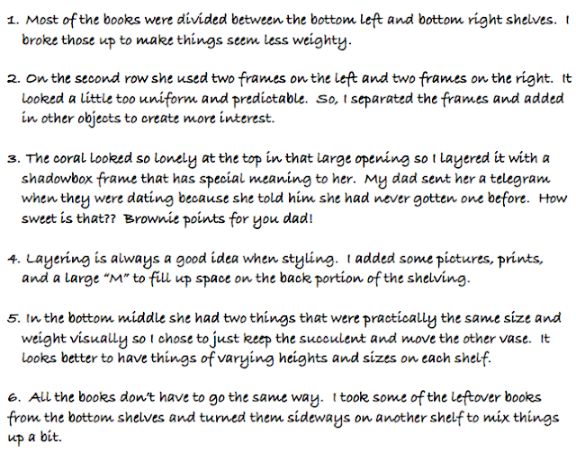
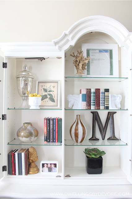
I used all items she already had to prove that you don't have to run out and buy new things to have pretty shelves! Also, my mom's taste is a little more traditional than mine and she is drawn to more ornate things. I wanted to make sure that it was something that she loved and reflected her style as well. We will probably do a little tweaking and maybe add in a few new things if we come across them, but this is a good start. Here are some things I did to make things look a little more proportional and work better together.
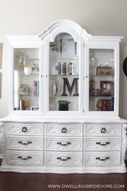
let's open those doors up so we can see a little better...
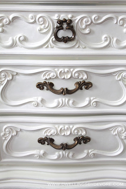
I love the swirly feminine details on the base.
As I was looking through these pictures I already noticed a few things I would like to tweak. I guess it's true what they say, the decorating is never done!






9 comments:
Gorgeous hutch and your vignettes are beautiful. Great tips. Hugs, Marty
Thanks Marty! She did a great job!
You and mom make a great design team. Its amazing what a coat of white paint did for the furniture and what a couple of tweaks did for the display styling. And the meaningful addition of the telegram is so sweet.
What a difference! You did such a great job!
glorious! i heard a choir of angels sing when i scrolled and saw it!
Your oversized M is such a great contrast! Awesome job, and step by step tutorial!
Your mom's got some talent and I love how you styled it. Looks so pretty together.
Beautiful hutch! The swirly details are amazing. You did a great job styling. That's something I really struggle with. Decorating shelves seems easy, but it's really an art. Thanks for the great tips.
I seriously loved this post so much. I LOVE to read about how people style and their reasoning behind why they do it a certain way. Your mom obviously has some great style already, but I love what you did! It looks balanced and beautiful.
Post a Comment
Thank you for your sweet comments, they make my day!